SLK Blog
The Benefits of Responsive Design
Most people that have had websites built in the past are fairly (or not so fairly) content with the design and functionality. Times are changing - heading into 2014 and beyond, it is reported that 5 billion people will use mobile phones by 2017.
That's a lot.
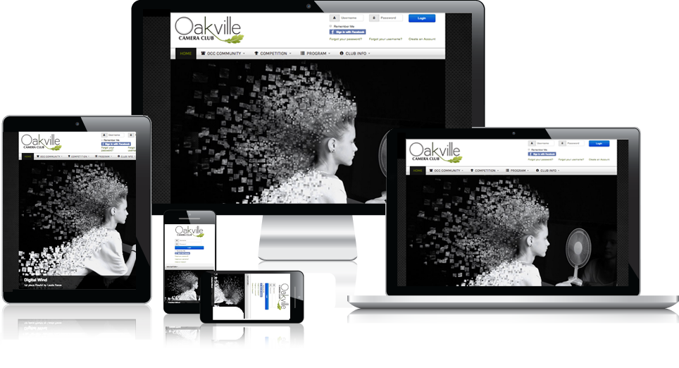
Have you ever been to a website on your smartphone or tablet, and had to zoom it to hit a button, or scroll like crazy to get where you wanted? Pretty frustrating, isn't it. Sites like those, are not muti-device friendly. In other words, they aren't responsive.
You need your website to be responsive. Here are the reasons why:

#1 - Increased Sales & Conversation Rates
With 70% of users leaving websites out of frustration of load time and website flexibility (aka, zooming and scrolling too much to get to where they want), this is probably the most obvious reason why responsive design is king. With responsive design, the entire site experience improves drastically. With usability sky-rocketing, users will have an amazing experience going through your site, whether it is to purchase product or gather information.
#2 - Increased Visibility Within Search Engines
Google suggests that responsive websites rank much higher in local search results than not. This is huge. Top spots in Google = much, much more visibility for your website. Responsive design also ensures that fewer resources are wasted - what we mean by this is, without building a completely separate mobile website to accommodate for the lack of responsiveness your website should already have, less resources are being used. In other words, your site loads faster, which gives your users a much richer experience.
#3 - Increased Reach To Tablet / Mobile Audiences
When smartphones became popular, web designers and developers used to make separate websites strictly for mobile. With tablets being the driving force behind responsive design, this is no longer the case. Designing your site responsively doesn't hinder your website to just one screen (a smartphone) - it literally shape-shifts to any screen size the world has to offer. Responsive design doesn't limit you, and it shouldn't.
#4 - Time & Money = Saved
This is a no brainer. You only have to create on website, that shape-shifts to any device that comes in it's way. You don't need a separate site for tablets, another one for smartphones, and lastly, a third for your laptop or desktop. All you need, one. This cuts down on time & money drastically.
Responsive design, simply, is the future of web design. Not only will it make your business more money and the user experience more rich - it will also save you time and money.

