SLK Blog

The official SLK I.T. Solutions Inc. blog

New Website Launched for Tacey Atkinson

Tacey Atkinson, like many other independent entrepreneurs, was at a loss. She had spent months working with unreliable website builders only to be left with a product that still did not meet her standards. She had a clear vision, a modern site that kept her “customers first” mission at the focus. Frustrated she turned to her peers hoping for some advice, luckily she was able to get a referral to SLK by a previous client. SLK was quick to act. Click the link to find out how we helped Tacey show her passion in an elegant way.


Visit Website  Visit PORTFOLIO
tacey atkinson portfolio screen
Continue reading
  1977 Hits

New Logo and Website Launched for Hodur Construction Inc

John wanted a new elegant website with the ability to manage his content and projects in house. With a fresh modern logo and website John is now able to keep his content fresh and updated as projects are completed. Having multiple galleries based on each project allows his visitors to see all stages of a project and to see the potential of their own next project. John's visitors now have a direct avenue to contact him and to start the process for their next big project. Click the link to find out how we helped John show his passion in an elegant way.


Visit Website  Visit PORTFOLIO
Hodur Construction portfolio screen
Continue reading
  2329 Hits

New Website Launched for European Monuments

European Monuments needed the ability to showcase the amazing hard work and dedication that goes into creating each one of a kind piece at their Oakville location. Using high resolution images and beautiful galleries partnered with a clean and modern website has given them the ability to reach a boarder audience. Having an open line of communication and the ability to keep the content fresh and up to date was just one way we helped bring their outdated website into this responsive world. Click the link to find out how else we helped this estabilished business stand out in the heart of Oakville.


Visit Website  Visit PORTFOLIO
european monuments portfolio screen
Continue reading
  2505 Hits

New Logo and Website Launched for Embrace Health Services

Arlene needed the ability to spread her message to a greater audience. With a fresh new modern logo and easy to manage website, Arlene is able to show her passion for all things health and to build discussions around important topics that affect everyone. Having a blog allows her to raise awareness for issues that are affecting society in this modern age. Click the link to find out how else we helped Arlene bring her message to life.


Visit Website  Visit PORTFOLIO
embrace health services portfolio screen
Continue reading
  2692 Hits

New Website Launched for Edges Skate Sharpening

Kyle needed a website that would set him apart and showcase why he is the best place in Milton to get your skates sharpened. Kyle's passion and dedication was the foundation to creating a modern and clean website that was fully responsive plus easy for him to manage. Big and bright images make Edges website a pleasure to view. Click the link below to find out how else we helped Kyle bring the right edge to Milton's skating scene.


Visit Website  Visit PORTFOLIO
edges skate sharpening portfolio screen
Continue reading
  2896 Hits

New Website Launched for Danmare Group Inc

Easy to manage, clean, responsive and professional, plus the ability to have a direct line with clients on any device is what set Danmare's website apart from everyone else. Danmare needed the ability to change their content to reflect all projects as they are completed. We choose the bright blue and grey from their logo to bring life to their outdated site.


Visit Website  Visit PORTFOLIO
danmare group portfolio screen
Continue reading
  2547 Hits

New Website and logo for First Class Fleet Services / First Class Spring & Suspension


Letting your customers know what you’re really about can go a long way. When First Class approached SLK to revamp their logo and create a custom website, we knew people had to get a glimpse of the hard work and professionalism that goes on behind the scenes. We were able to do this by incorporating high quality photography into the website and letting the pictures speak for themselves. Visit our portfolio to read more on how SLK helped First Class Fleet Services / First Class Spring and Suspension stand apart.

first class portfolio screen

  Visit Website  Visit Portfolio

Continue reading
  2822 Hits

New Webiste and Logo Adjustments for Chasing Happiness

Word travel and life happiness is what made this website stand out. Redesigned logo and custom mockup let SLK transform this outdated website into an easy to manage outlet for Crystal to stay in contact with all her readers and followers. Visit our portfolio to read more of how SLK helped Chasing Happiness reach her audience easier.


Visit Website  Visit PORTFOLIO
chasing happiness portfolio screen
Continue reading
  2609 Hits

New Website for Hitherfield School

Elegance and a touch of nature is what made Hitherfield School’s website come to life. Freshened up the logo and a full mock-up allowed SLK the ability to transform their outdated site to a newly modernized and easy to use website that will stand apart from other private schools. Visit our portfolio to read more of how SLK helped Hitherfield School with the transition.


Visit Website  Visit PORTFOLIO
hitherfield school desktop
Continue reading
  2705 Hits

New Logo and New Website for TWT Productions

SLK is happy to add to our ever growing family. We are proud to launch a new logo and website for TWT Productions. We were able to capture Tony's love for all things multimedia in the website and logo. Visit our portfolio to read more of how SLK helped TWT stand apart.


Visit Website  Visit PORTFOLIO
TWT productions portfolio screen
Continue reading
  2671 Hits

New Revive Skin Clinic & Boutique Website

Every time we launch a new website it’s always a momentous occasion for us. Our clients at Revive Skin Clinic & Boutique put their faith in us to create a website that showed the elegance and exclusivity of their business, and the treatments they offer. It was a great experience for all of us, and we look forward to continuing to help their business grow. Visit our portfolio to take a look at their serene and beautiful website.


Visit Website  Visit PORTFOLIO
revive skin clinic portfolio screen
Continue reading
  2493 Hits

Typography and your website

typography header 2

Now that we’ve gone over colour, let's look at another seemingly small element that can make a huge difference in the look of your website. And you’re looking at it right now, your website’s typeface and font.

Before we go any further, let’s clear up what we mean by those terms. Contrary to popular belief, font does not refer to the different names of different texts, i.e. Times New Roman, Helvetica, Cambria etc. Those are typefaces. Font refers to the different forms within a typeface, i.e. bold, italics, size of the letters etc.

It’s important to use a typeface to its full potential. A website can be completely transformed just by a simple typeface switch.

Continue reading
  2804 Hits

Picture Perfect: Tips for Any Photographer with Any Camera

As we know by now, images are far more effective at catching people’s attention than text. However, not any old image will get you noticed. With the rise of high quality cameras in smartphones, it seems that anyone can become a skilled photographer. But just because the technology has gotten more advanced, doesn’t mean the basic rules of good photography have changed. An image can be high resolution, colourful and in focus, but if you don’t follow these basic rules of design, your photo will fall flat.

Ensure Every Post has Value

Despite our first instinct to put the subject of our picture in the centre of our frame, a subject that is offset to one of these intersections is actually more visually appealing and more dynamic than a subject that’s photographed head-on. This is because the rule of thirds follows the natural eye movement that people experience when looking at an image for the first time. Here is an example of how we used this principle for Whole Home Solutions.

rule of thirds firstrule of thirds second


Visit Website  Visit PORTFOLIO


Considering Lighting

Lighting can be the deciding factor between an outstanding photograph and a lackluster one. You always want your subject to have as much natural light as possible, as sunlight is usually always softer and more flattering than artificial light. If there isn’t enough natural light, you can get great results with properly placed light, but make sure that you don’t try to combine light sources in an attempt to brighten the image. Sunlight and artificial light are different hues and having them both in one image can cause a disruption in the white balance and negatively affect the colouring and atmosphere of the shot.

Also avoid flash whenever possible. We’ve all been on the receiving end of a shot that washes the colour out of our face, gives you red eye and looks the complete opposite of capturing a natural moment. These photos used for NuSkin+ Estetika is a great example of using light to create a soft and natural final product.

natural lighting

Visit Website  Visit PORTFOLIO


Don’t Be Predictable

If your website is going to contain a lot of visuals (which it should to be eye catching for your viewers), you’ll want to keep the images new and exciting, so that viewers don’t get bored and to ensure every page will be uniquely eye-catching. Changing up the subject matter, angles, colours and depth of field are all great ways to get a diverse collection of images. Here are a few examples of how using close ups, different perspectives, and highlighting different colours can keep photographs that all have a common theme unique and stand out from one another.
With these tips in mind, get your camera out and start shooting! The best way to find out what works and what doesn’t is by practicing. And not to worry, if you’re too busy to have a photo shoot or are still lost behind a lens, that’s what we’re here for. Contact us today to see how SLK can help your business stand out with beautiful photography.

That’s a good place to start, but photography can be a tough maze to navigate. Find out how SLK can help boost your business with multimedia.
multimedia

Continue reading
  3412 Hits

Getting Noticed on Social Media

Social media has saturated almost every aspect of communication, sharing and staying connected in today’s world. Having a presence of social media is non-negotiable for any successful business. But with more than 1 billion daily active users on Facebook alone, how can your business stand out?

1) Ensure Every Post has Value

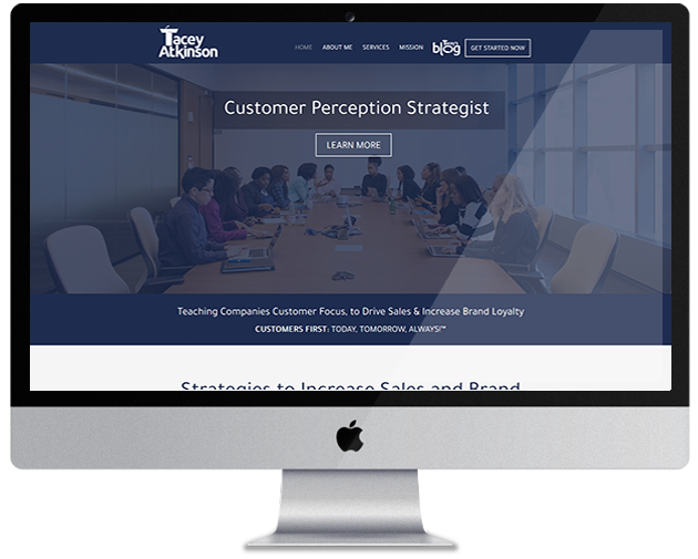
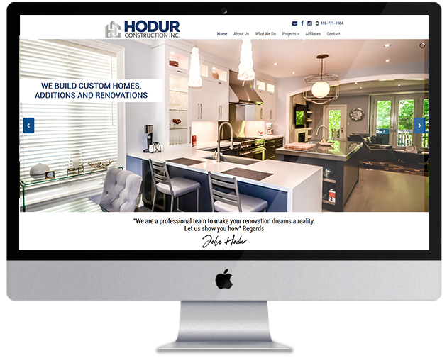
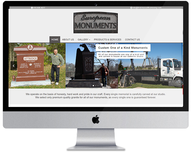
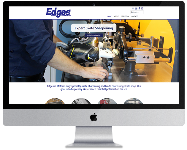
While it seems that our newsfeeds are filled with pictures and videos of cute animals and funny comics, as a business it’s important to offer your clients something unique and important that they can only find with you. It doesn’t help to build your brand by sharing the most popular content just to keep up with the crowd.

good post
Example of Good Posts
bad post
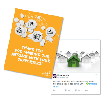
Example of Bad Posts


Content you post and share should always support and reinforce your brand and remind your clients why they use your service or product to begin with. While funny content is a welcomed comedic break once in a while, it’s important to always offer your clients something that helps your business. Whether it’s a link back to your website, a call to action button that encourages them to contact you, engage with your page or website, or share your content for their friends to see, you should never lose sight of your business’s objective. Maintaining a strong brand will keep your brand at the forefront of peoples' minds.


2) Make Engagement Easy

The more people engage with your social media pages, the better. The first step is to offer them value, and the next step is to get them to participate. The more people that like, comment and share your posts will result in more people seeing your business, and ultimately more people visiting your page and learning about what you do.

A great way to get engagement is to offer a promotion or host a giveaway. Get clients to comment saying why they love your business or how it’s been helpful to them, and choose a winner at the end of the week and give them 20% off (or whatever discount you choose) on their next invoice. Be creative! See what product or service is most popular among your clients and tailor your deals to that. If you make participation easy and worth their while, they’ll be happy to spread the word for you.
add value to posts

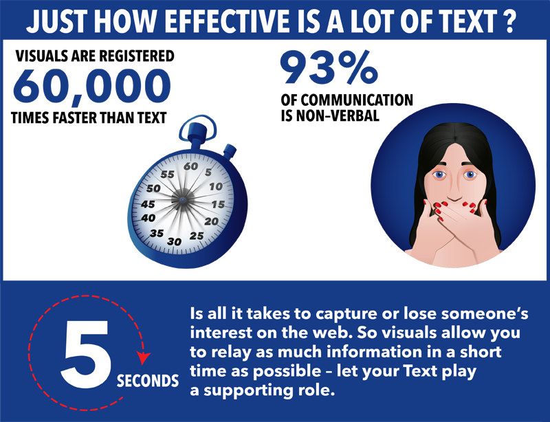
3) Keep it Short and Sweet

Now more than ever, people are bombarded with new information and content constantly. Unfortunately, this means that our attention span has become shorter and shorter. People want to see the benefit of a post right away and if it takes too long to find, they’ll move on.

That’s why it’s so important to be direct, and most importantly, brief. Draw your clients in with a catchy headline and then link to an in-depth article so they can learn more. They’re more likely to stay and read more if you catch their interest within the first two seconds of reading. Or better yet, post a picture or infographic. Images perform much better than text-based posts across the board, as they’re bright, catchy and don’t involve a lot of time investment from the viewer.
bore audience

That’s a good place to start, but social media can be a tough maze to navigate. Find out how SLK can help boost your business through social media.


online marketing
ONLINE MARKETING

Continue reading
  2923 Hits

Amaze Your Audience with the Power of Colour

When creating a website, most people think of content first. They want their written content to be strong and informative so that their readers will be more inclined to use their product or service. However, a strong and effective website doesn’t start with content. It starts with design. If your content is clear and well written, but your design is sloppy and doesn’t catch the reader’s eye…sorry to say, but they’re moving on. Before you even get to branding, or graphics, or layout, start with the most basic design principle: colour. While text takes times to read, colour can convey a message or feeling instantaneously. So how do you pick the right ones? Well for starters, it’s not as easy as just picking your favourite ones and integrating them all in your site. Different colours express different things.

Here’s a brief look at common meanings of the most common colours:


red
blue


yellow
green


white
black


gray
brown


From here, you can pick the colours that represent who you are as an individual or as a business. After that, it’s all about using your selected colours effectively. And here are some tips how:

get to know your colour wheel
Get to Know the Colour Wheel 


This will help you create a strong brand image and won’t overwhelm the viewer. Try to have two neutral or subdued colours, and one or two bright colours for added emphasis and visual intrigue. By keeping a consistent theme throughout your entire website, your viewers are more likely to remember your brand, and colour is the easiest way to achieve that
stick to three or four colours for your website
Stick to Three or Four Colours Throughout Your Website


Certain colours naturally complement each other, such as blue and yellow. Others do not, such as red and orange. Not surprisingly, blue and yellow are an example of complementary colours. These are colours that are opposite to each other on the colour wheel. Get to know these pairs and use them to your advantage. The colour wheel is also divided into cool tones and warm tones. This is also something to consider when picking a theme for your website.
use natural colours
Use Natural Colours


Bright reds, greens, and blues might seem like a good idea to attract readers, but using these bold colours can actually have the opposite effect. They can cause eye fatigue and confusion to the viewer. Using a more natural palette of colours will make your website feel more approachable and professional. These are colours such as taupe, brown, grey and white. Using a natural shade of a brighter colour, however, is great for emphasis and drawing the reader’s eye to a certain part of your website.


Once you have your colour scheme in place, the more in depth design is next. Confused about where to start? No worries, we can help you there. Check out how we can help design, create and brand your website here https://www.slkitsolutions.com/it-solutions/web-design-and-web-development

Continue reading
  2982 Hits

Visuals Vs. Text — How to Find to Right Balance for Your Website

visual vs text image

It’s no secret that websites are becoming increasingly more visual as opposed to textual. Think about it: visuals are the first thing your eyes go to, and they make a first impression way faster than any written word.
Many websites are shifting to increased visual content because it gets their product or service across to potential customers immediately. You only have about five seconds to capture someone’s interest before they decide to move on to another page or site, so visuals allow you to relay as much information in a short time as possible.
This is why we’re seeing more and more website with big, bold images that take up the entire homepage. If you can hook a customer in at their first glance, they’ll be more inclined to navigate the rest of your website to see what other cool things you’re offering.

 
Continue reading
  4359 Hits

New Dr. Marta Bejuk Website

Today's launch of Dr. Marta Bejuk's new website has us all buzzing with excitment. The playful nature of the website made the process very enjoyable from beginning to end and we'll definitely miss the fun research phase of this project. Visit our portfolio to see the wonderful extensive project we embarked on with Dr. Marta Bejuk.


Visit Website  Visit PORTFOLIO
dr marta bejuk portfolio screen
Continue reading
  3499 Hits

The Best Way to Make Your Best First Impression

When creating a website, most people think of content first. They want their written content to be strong and informative so that their readers will be more inclined to use their product or service. However, a strong and effective website doesn’t start with content. It starts with design.

Continue reading
  3714 Hits

What Makes A Good Business Logo

In this day and age, your brand can make or break the way people view your business. There are a lot of factors that make up your brand - colour scheme, trust, value, etc. However, there is one core piece to any businesses' brand that people relate and identity with, and it happens to be the most important.

The logo.

Continue reading
  4417 Hits

The Power of Multimedia Video and Photography

You've just created a business - or maybe, your business has been around for a while. Either way, it's time to hit the ground running and market your company. The problem is, you ask yourself - "where do I start?". Getting professional, 1080p, high definition photography or videography done can boost your company's image ten-fold. It is imperative that you understand your company image is everything. You only get once chance to make a lasting impression - why not leave your competition behind, and make it in high def?

Continue reading
  3747 Hits